Praha 6 Case Study, Unselected

Cooperation: Petr Kulhánek
Project: The District of Prague 6 announced an open competition for a new visual identity to unify and systematize visual communication, including selected
companies
companies
Goal: Create a visual style that will not be just a logo, but a logical and complex system forming a unified visual identity of Prague 6
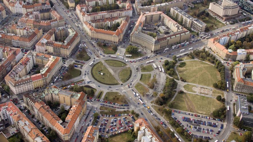
About Praha 6
- The largest and most populated part
- Central point "Kulaťák"
- Lots of historic buildings and parks
- Seat of several universities, National Technical Library
- More than 40 embassies are located here
- Villa and luxury neighborhoods
- Central point "Kulaťák"
- Lots of historic buildings and parks
- Seat of several universities, National Technical Library
- More than 40 embassies are located here
- Villa and luxury neighborhoods
Key words
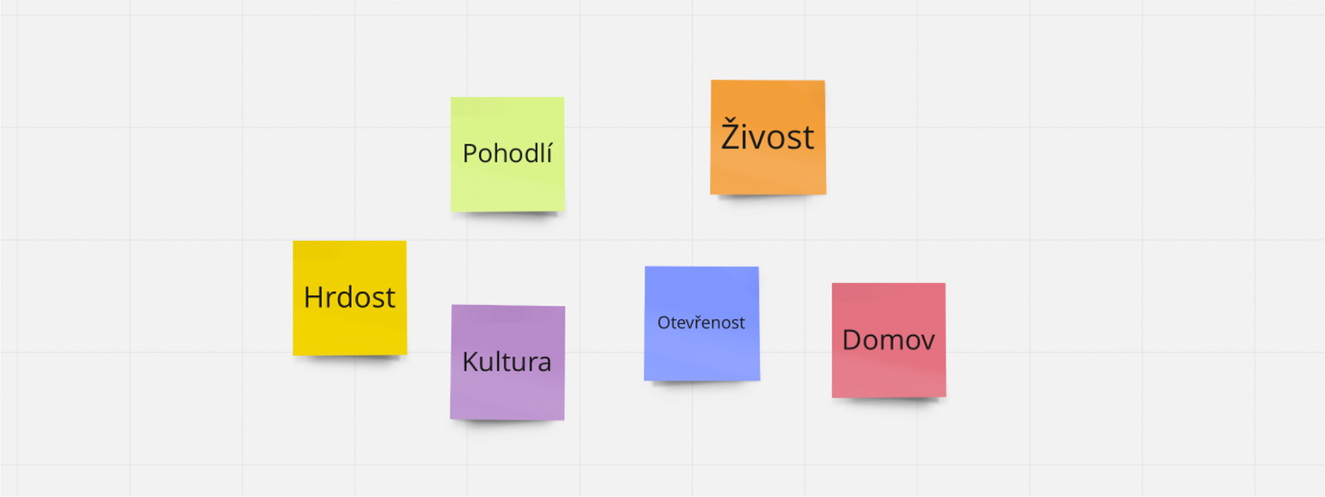
Screenshot with key words from app Miro
How we worked
Research -> brainstorm -> sketches -> refinement -> application
Research
In the first phase, we examined Prague 6 itself from all sides. How it has communicated so far, what outputs it has, and what it publishes. Also what it actually looks like and how it is lived in. We tried to reflect all these conclusions in our proposal. We took inspiration from both domestic and foreign cities, towns, and cultural centers.
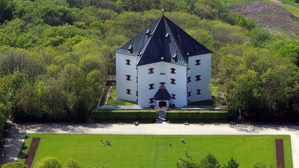
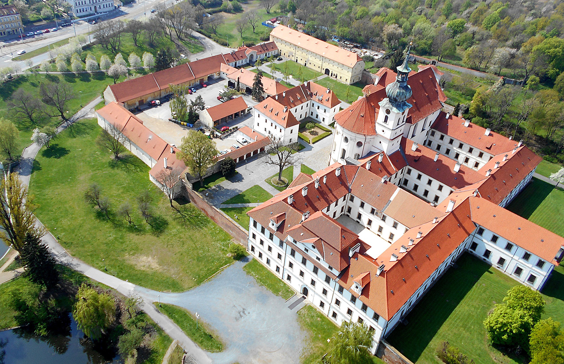
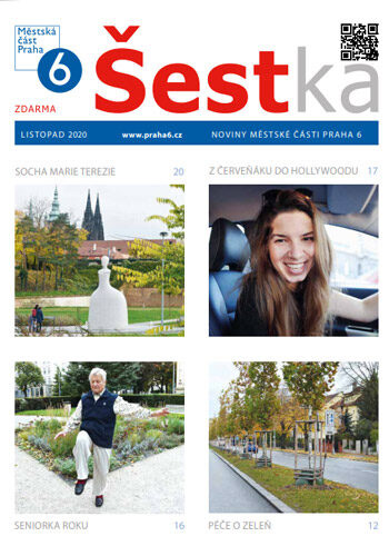
"Kulaťák", previous logo of Praha 6, letohrádek Hvězda, Břevnovský klášter, radniční noviny Prahy 6
Summary
From our research, we have drawn several significant findings
Identity must be:
- Recognizable and functional across individual outputs
- Readable to serve people and not just reflect current trends
- Timeless and modern
- Readable to serve people and not just reflect current trends
- Timeless and modern
Sketches
The biggest challenge was to create such a symbol that would combine individuality, pride, and tradition. We decided to work only with the name "Prague 6", exploring several ways of how the symbol would look like


Beginning of our work, first drafts
Thanks to sketching, we realized that we needed to add a new dimension to the design and focus more on the unmistakability of the symbol itself.
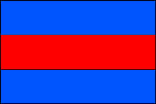
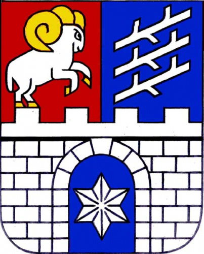
The color scheme refers to the ancient history of this district, as well as to its flag and emblem, which is a combination of the two original emblems of the municipalities of Břevnov and Bubeneč from 1904.

Finding the right colors
The colors needed to be changed a bit to maintain harmony and contrast.
Refinement
We finally found the required symbol in a combination of sans serif typography for the name of the capital (Helvetica Now Display) and the Roman numeral VI (Baskerville Ten). The symbol represents historicity, international relations and a very decent standard of living in this part of the city.


Final logo
The logotype thus combines both the rich history of Prague 6 dating back to the 6th century and the modernity of the world metropolis. The number VI also refers to the already mentioned diplomacy and law, in whose writings and norms these ancient numbers are found.

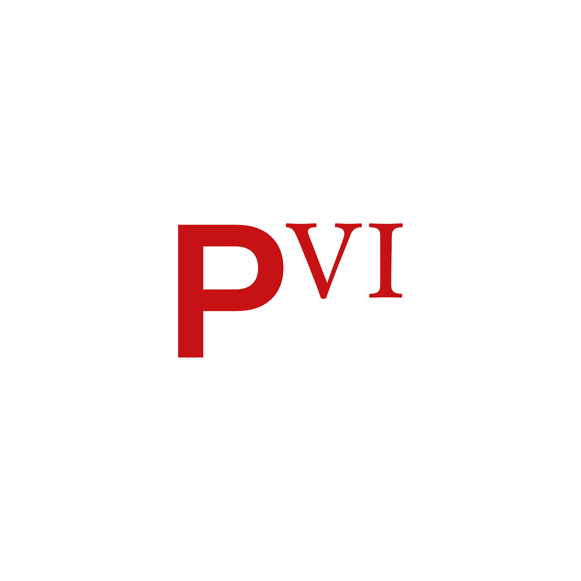

Final logo
Application
The communication potential is further developed thanks to the character of the numbers, which can also function as text and can therefore be substituted for the syllables -vi- in the text (Břevnovské vinobraní; Rozsvícení vánočního stromku; informační grafika Víte, že na Praze Vi)
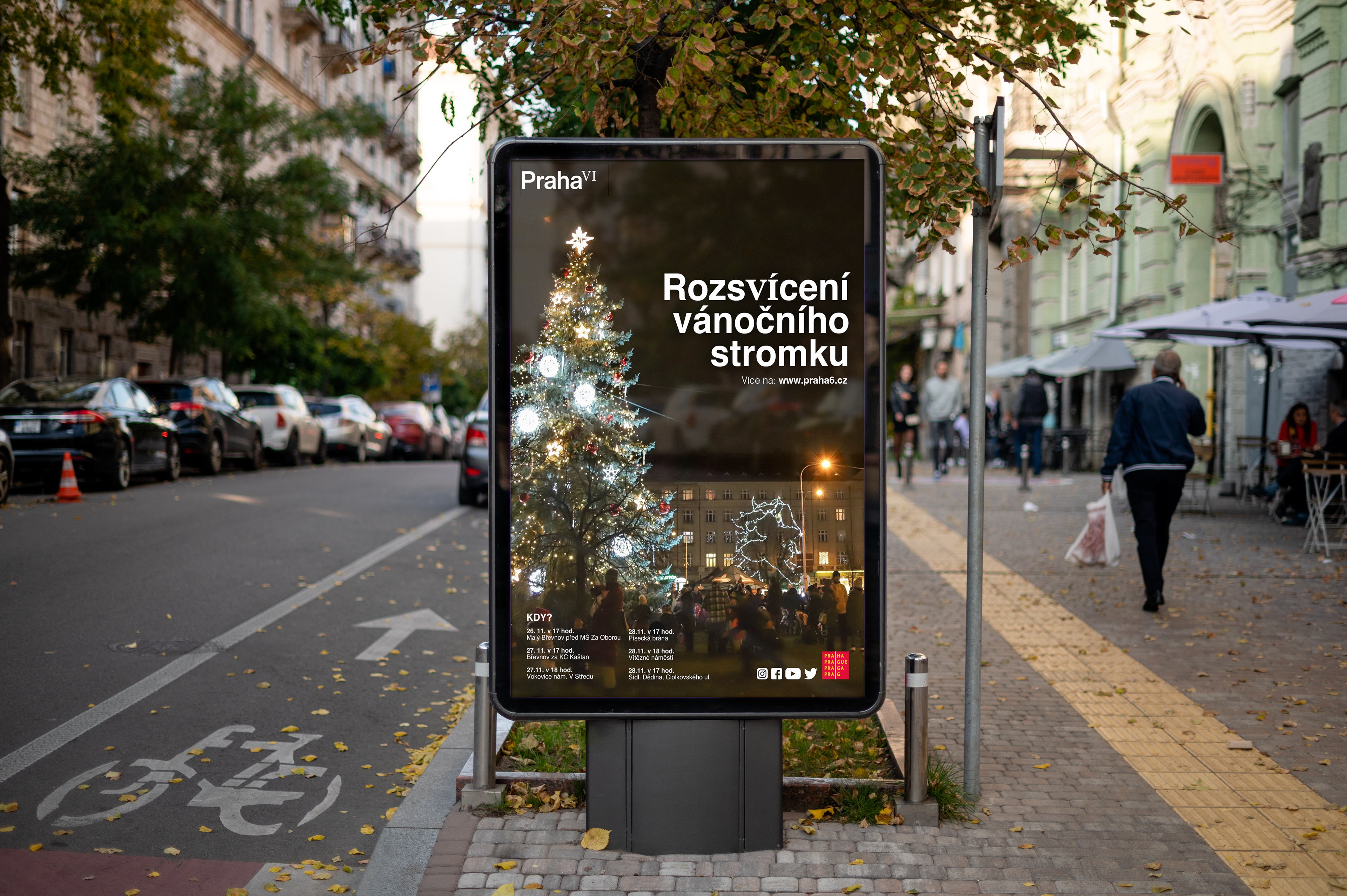

Posters according given specifications
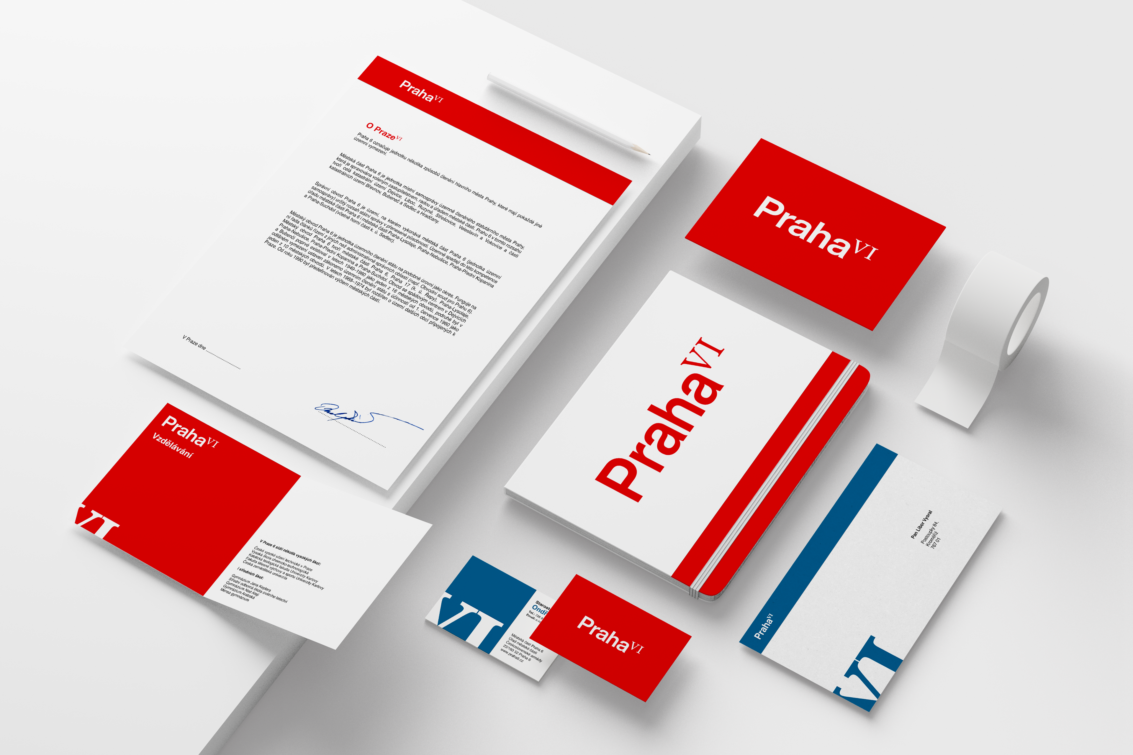
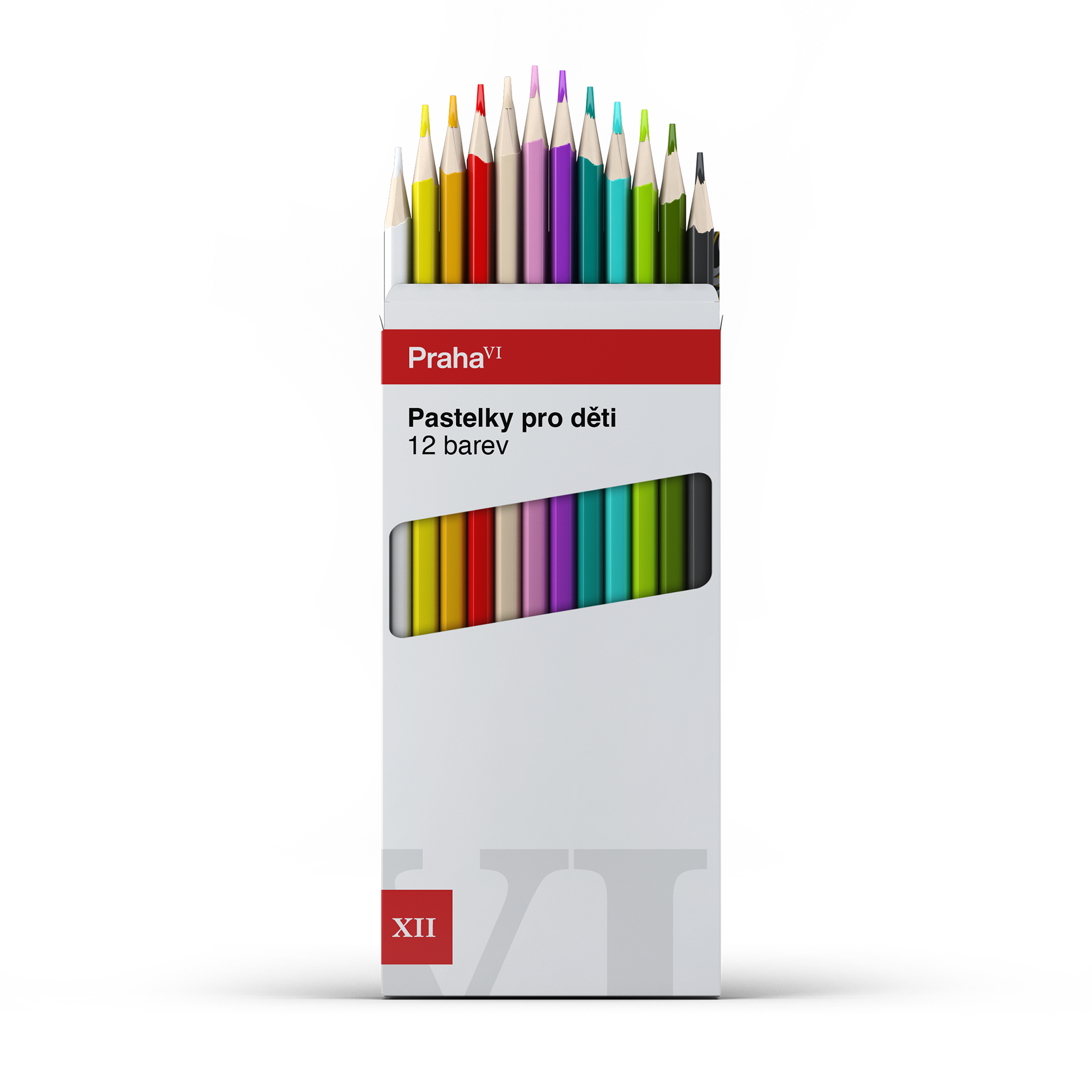
Office supplies
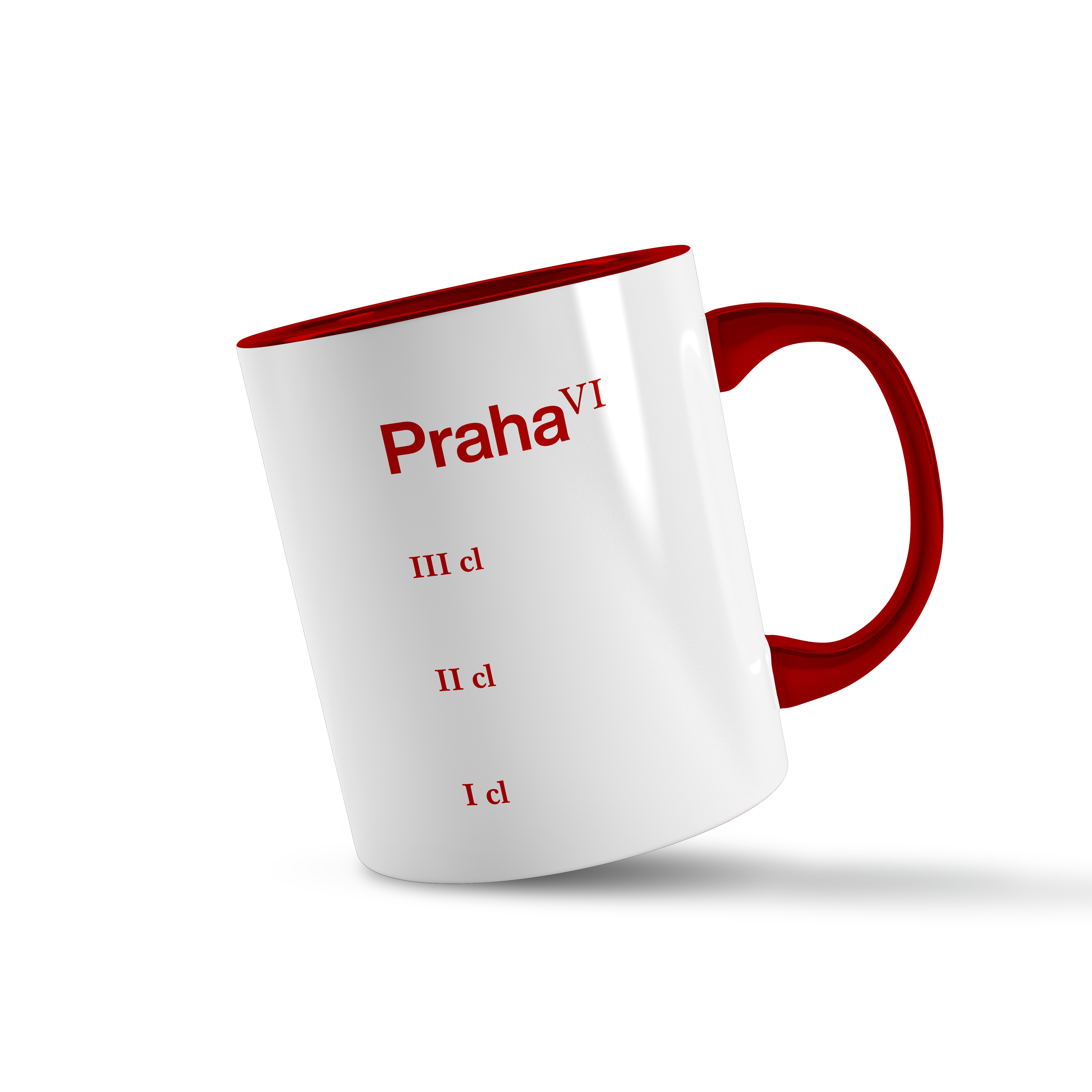
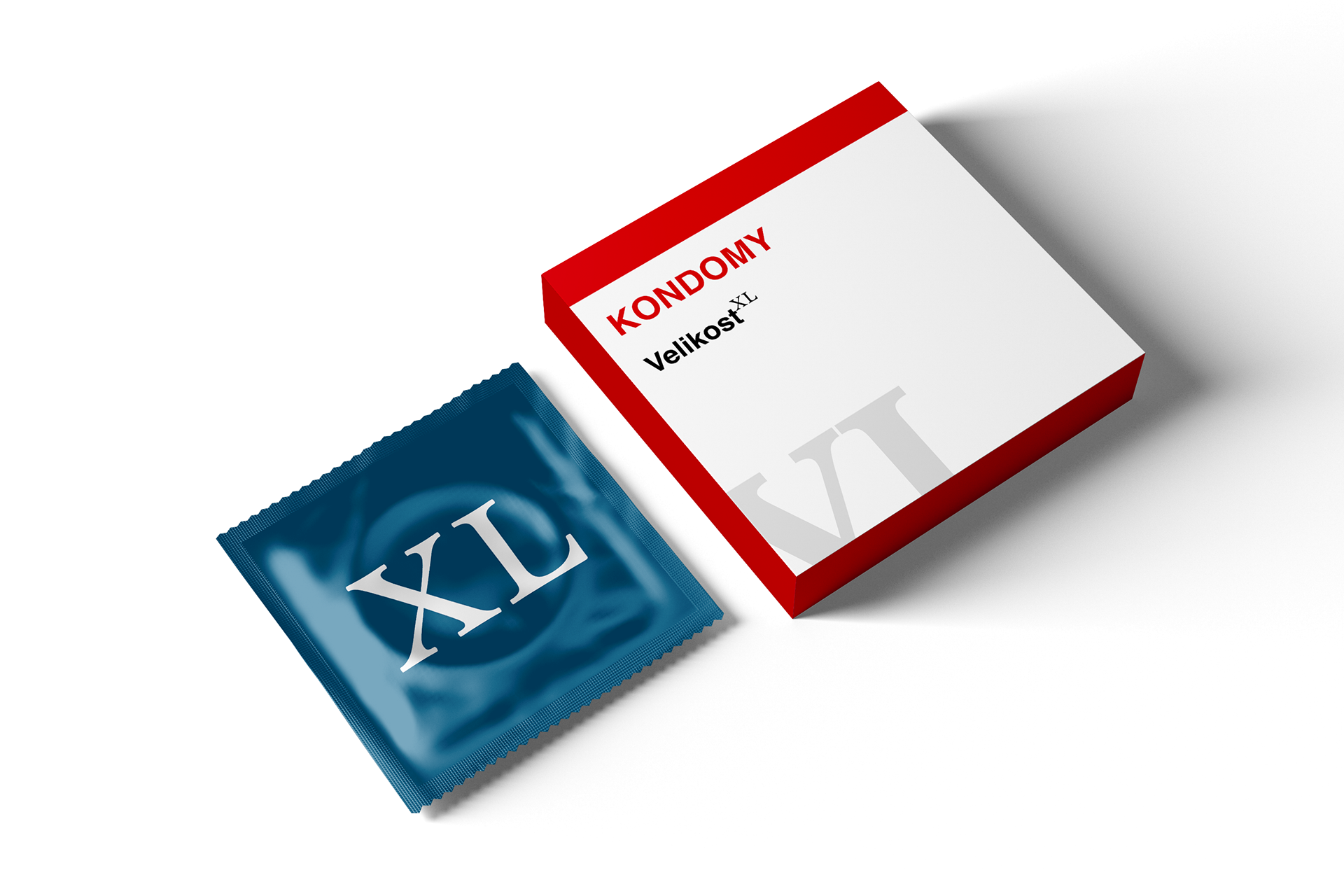
Merchandise
Numerals can function not only as numbers but even as a notation of size. Such writing would appear on t-shirts and other merch, for example.
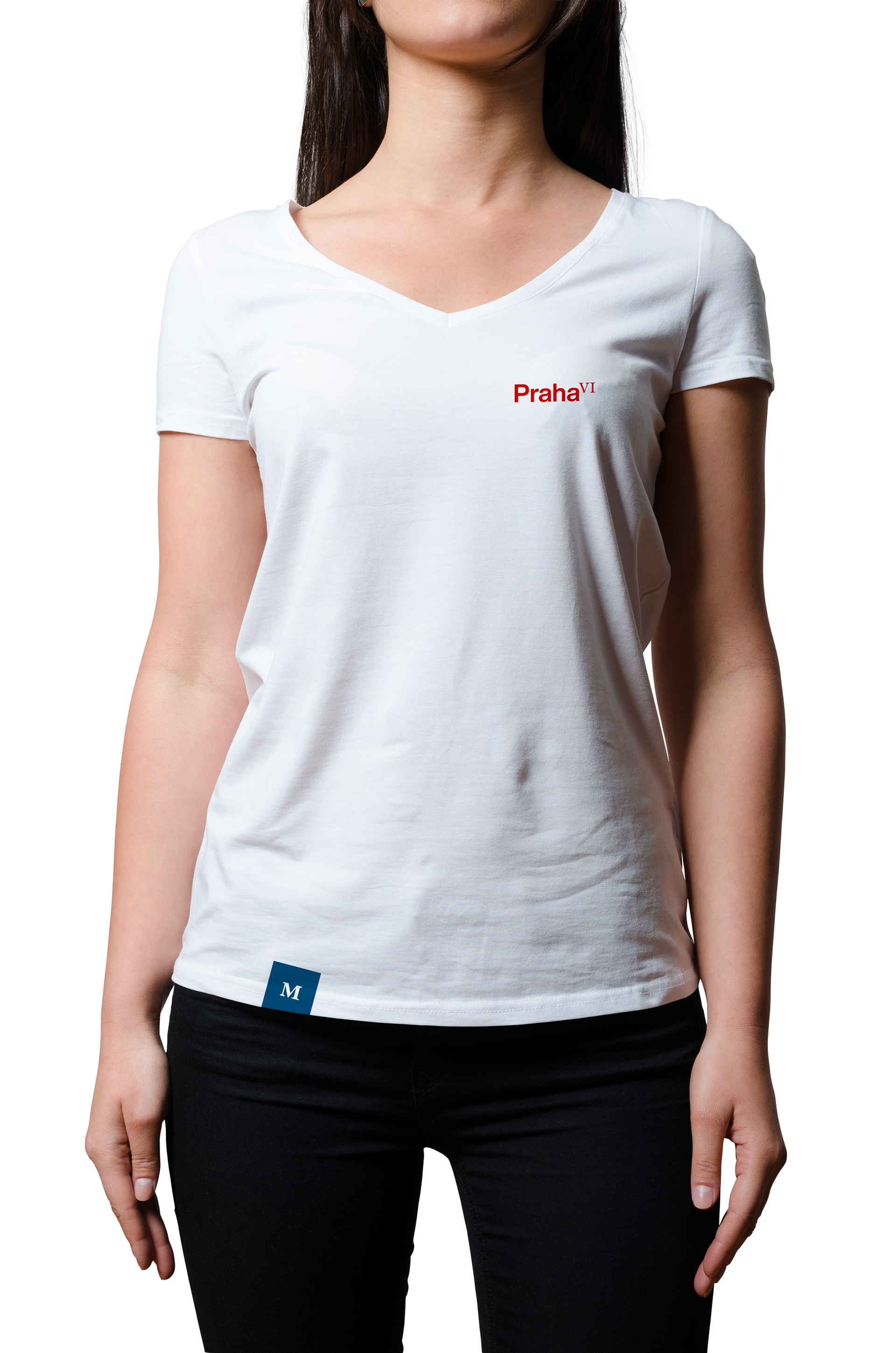
Merchandise
The result of the project
We managed to develop a unique branding for Prague VI, which shifts from current trends in visual identity design, but at the same time looks timeless and would last this proud part of the city for many years to com